If you have to explain the diagram, the notation failed
The C4 model tells you what to draw — the levels, the abstractions — but deliberately says almost nothing about how it should look. It is notation-independent by design. That freedom is a gift and a trap: it means the quality of a diagram rests entirely on the notation choices you make, and most of us make them by accident. The single test that matters is this — can a reader interpret the majority of the diagram without asking you questions? If they can't, the notation failed, no matter how correct the boxes are. This post is about the craft of getting there, and it turns out that craft has a genuine scientific basis, not just a stylistic one.
Notation is the visual language of a diagram: its shapes, colours, line styles, icons, and labels. C4 is explicitly notation-independent — it standardises the abstractions, not their appearance — so it recommends every diagram be self-describing, with a title, a scope, and a key. See c4model.com.
A diagram's job is to be read without you
Start from why we draw at all. Larkin and Simon's classic cognitive-science paper, Why a Diagram Is (Sometimes) Worth Ten Thousand Words, showed that a diagram and a paragraph can carry identical information and still not be equal: a good diagram groups related information spatially so the eye finds what it needs without the mental search that prose demands.1 That "sometimes" is doing a lot of work — the advantage only holds if the diagram is built well. A cluttered or inconsistent diagram throws away exactly the perceptual advantage that made it worth drawing.
And reading a diagram is a learned skill, not a natural one. Marian Petre's study of expert and novice diagram readers — pointedly titled Why Looking Isn't Always Seeing — found that experts extract meaning from layout, grouping, and convention that novices simply don't perceive; much of a diagram's meaning lives in its secondary notation, the informal cues (alignment, spacing, consistent placement) that aren't part of the formal syntax but carry half the message.2 The practical consequence is uncomfortable: the diagram that's obvious to you, its author, may be opaque to the new hire it's supposed to onboard. Consistency is what closes that gap. A notation you apply the same way every time becomes learnable; one you improvise each diagram never does.
Consistency is the notation
This is the heart of it. A good notation isn't created by clever symbols — it's created by consistency. Once a reader learns your convention, every later diagram reads faster. Break the convention and you've silently reset them to novice. So pick an orientation and keep it: there's no rule that people go on top and databases on the bottom, no correct left-to-right or top-down — but whatever you choose must mean something and stay put. A direction that's meaningful in one diagram and arbitrary in the next is worse than no direction at all.
The most rigorous treatment of this is Daniel Moody's The "Physics" of Notations, which set out to give visual notation design an evidence-based footing instead of leaving it to taste. He distilled nine principles from perception and cognition research for building notations that are actually cognitively effective.3 Almost every rule of thumb below is one of Moody's principles wearing work clothes — I'll name them as we go, because knowing the principle tells you when to break the rule.
Names, not codenames
Naming is one of the hardest things in software, and a box with only a name in it is a puzzle. "PaymentService" tells a reader far more than "LOGIC-7" or an internal codename ever will. Acronyms, abbreviations, and internal names make a diagram harder — sometimes impossible — to read for anyone outside the team that coined them. The exceptions are genuine domain vocabulary: HTTP, JSON, SQL don't need explaining to your audience. Everything else either gets an intent-revealing name or goes in a glossary. Moody calls this Semantic Transparency — the appearance and labelling of an element should suggest its meaning rather than require decoding.3 Internal codenames optimise for the people who already know; a diagram should optimise for the people who don't.
Then give each element more than a name. A name alone forces the reader to know by heart what it implies; a small card of name, type, technology, and a short description removes the guesswork:
| Field | Why it earns its place |
|---|---|
| Name | Intent-revealing, no codenames |
| Type | Tells the reader which level they're looking at — system, container, component |
| Technology | The key implementation choices (highlight the important ones; don't list everything) |
| Description | One line on what it does, so the box isn't a guessing game |
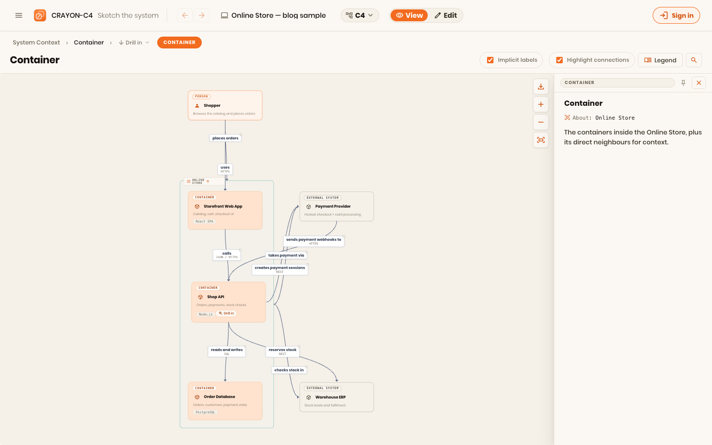
That pairing of a graphic (the box) with text (the card) isn't padding — it's Moody's Dual Coding principle: information encoded in both words and visuals is understood better than either alone, a result that goes back to Paivio's dual-coding theory in cognitive psychology.3 Version numbers are optional and come with a cost: put one in and you've signed up to maintain it on every upgrade.
Add shapes, colour, and icons only when they mean something
The discipline is to start plain — simple rectangular boxes — and add visual distinction only where it buys self-explanatory meaning. Every symbol you add spends part of the reader's attention budget, so spend deliberately. Moody's Graphic Economy principle is exactly this: the number of distinct visual symbols must stay cognitively manageable, because discriminability collapses as the vocabulary grows.3
When you do reach for a visual variable, use it to encode a real distinction — internal versus external, new versus existing, ownership, technical depth. Colour is excellent for this (it pops, and readers group by it instantly) with two caveats: it fails on monochrome printing, so never let colour be the only carrier of a distinction, and common practice is to keep colour consistent per level — a container is always the same colour, a system always another — unless you have reason to do otherwise. Shapes work too, but don't assume a shape is self-evident: a cylinder for a datastore is widely understood, most others are not, so treat a shape as a collection identifier ("these belong together") rather than a self-explanation of intent. Sizing carries almost no reliable meaning and wastes canvas — a big box holding the same card as a small one is just empty space. Icons can clarify fast, but an unfamiliar icon is just a picture-shaped abbreviation; if it doesn't tell the reader anything on its own, drop it.
The through-line is Moody's Perceptual Discriminability (distinctions must be visually obvious) coupled with an iron rule: every visual choice goes in the key. The moment a colour or shape means something, the diagram must say what — otherwise you've built a private code.
Relationships: one direction, read as a sentence
Arrows are where diagrams most often go vague. Two rules fix most of it. First, don't draw bidirectional arrows — give every relationship a flow direction. The convention that carries the most meaning for the least ink: the arrowhead points at the receiver, and the end without a head is the initiator. That alone tells the reader who starts the interaction, and it kills the reflex to draw a return arrow — a UI calling an API doesn't need a second arrow back, because a synchronous response isn't the API initiating a new call. A return arrow would wrongly imply both ends initiate.
Second, label the relationship so it reads as a sentence: element X → does something to → element Y. "Places orders through" beats "uses"; "reads pricing from" beats a bare line. Avoid vague nouns like "users" as labels; describe what actually happens. And be aware that an arrow can mean different things in different diagrams — a dependency, a data flow, a message, an event, push versus pull — so state which, in the label or the key, and stay consistent. Line style is a useful second channel here (dashed for asynchronous, solid for synchronous, say) — as long as, once again, it's defined in the key.
The legend is not optional — and neither is the boundary
Everything above collapses to one habit: make every choice explicit in the diagram key. If internal and external are different colours, the key must say so — and say what internal even means. Internal to this team? This company? The whole organisation? Where exactly is the boundary? This isn't pedantry. Leave the boundary undefined and different authors will draw it differently, and within a few months your organisation has a pile of diagrams that each use "external" to mean something slightly different and can no longer be read against each other. Moody frames the underlying requirement as Semiotic Clarity: one symbol, one meaning — no symbol doing double duty, no concept drawn two different ways.3 An explicit key is how you enforce it.
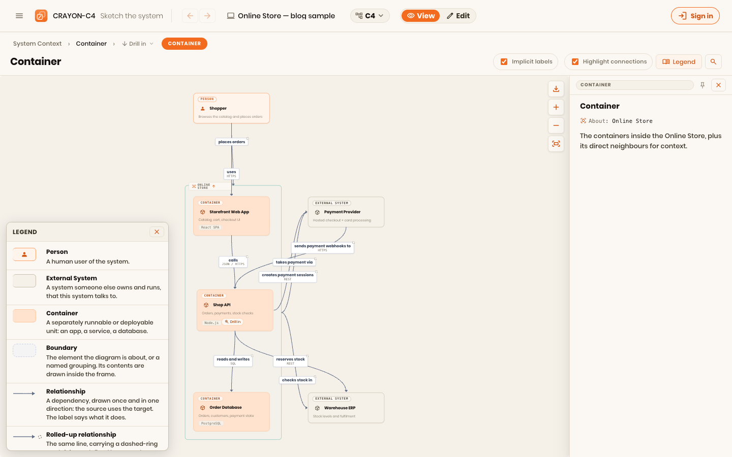
Which raises the obvious question: should there be one standard notation for everyone? In an ideal world, maybe. But a house standard usually isn't the point — a notation exists to tell a story within its context, and the right choices depend on the audience and the question. This is Moody's Cognitive Fit: different readers and different tasks legitimately need different representations, so the same model shown to a CISO and to a new engineer may reasonably look different.3 Consistency within a diagram and its series is non-negotiable; a single frozen notation across every context is not the goal. Tell the story clearly, define your terms, and let the story decide the notation.
Rules of thumb
- Pass the no-questions test. If a reader can't get most of the diagram without asking you, the notation failed — fix the notation, not the reader.
- Consistency is the notation. Pick an orientation, a colour-per-level, a line-style meaning — and never vary them silently.
- Names reveal intent; the card fills the rest. No codenames; carry name, type, technology, and a one-line description.
- Start plain, add meaning. Boxes first; shapes, colour, and icons only when they encode a real, explained distinction.
- Arrows point at the receiver, labels read as sentences. No bidirectional arrows, no vague verbs.
- If it's not in the key, it doesn't mean anything. Every visual choice — and the boundary behind it — goes in the legend.
This kicks off a second arc, stepping back from the tool to the ideas underneath it. CRAYON-C4 bakes much of this in — consistent per-level styling, element cards, directional relationships, and a key that stays in sync with the model — precisely so the notation is one less thing to get wrong by hand.
Next in this series: the model itself — why C4 is at once too much and too little, and why you rarely need all four levels.
References
Footnotes
-
Jill H. Larkin and Herbert A. Simon, "Why a Diagram Is (Sometimes) Worth Ten Thousand Words," Cognitive Science, vol. 11, no. 1, 1987, pp. 65–100. Diagrams can beat informationally-equivalent text by supporting perceptual inference and reducing search. Wiley ↩
-
Marian Petre, "Why Looking Isn't Always Seeing: Readership Skills and Graphical Programming," Communications of the ACM, vol. 38, no. 6, 1995, pp. 33–44. Reading diagrams is a learned skill; much meaning lives in secondary notation (layout, grouping, convention). ACM ↩
-
Daniel L. Moody, "The 'Physics' of Notations: Toward a Scientific Basis for Constructing Visual Notations in Software Engineering," IEEE Transactions on Software Engineering, vol. 35, no. 6, 2009, pp. 756–779. Nine evidence-based principles, including Semiotic Clarity, Perceptual Discriminability, Semantic Transparency, Graphic Economy, Dual Coding, and Cognitive Fit. DOI: 10.1109/TSE.2009.67 ↩ ↩2 ↩3 ↩4 ↩5 ↩6